Bake Your Day

Responsive website

Project duration: July 2022
See the entire case study

The product:

Bake your day is a bakery founded by Ukrainians in Canada. They offer a wide selection of various pastries from different cuisines. The typical user is between 20-40 years old, and most users prefer online shopping. Bake your day’s goal is to make it easy for all users to buy delicious baked goods online.
Bakery websites usually do not offer baked goods for people with diabetes, gluten-free and vegan pastries.

The problem:

Project goal:

Design the responsible website for Bake Your Day that provides a clear menu with filters for easy searching the specific pastries for all users. 
UX/UI designer leading the Bake your day website design from conception to delivery.

My role:

Responsibilities:

Conducting user research and interviews, paper and digital wireframing, low and high-fidelity prototyping, conducting usability studies, accounting for accessibility, iterating on designs and responsive design.

Research & Define

Summary

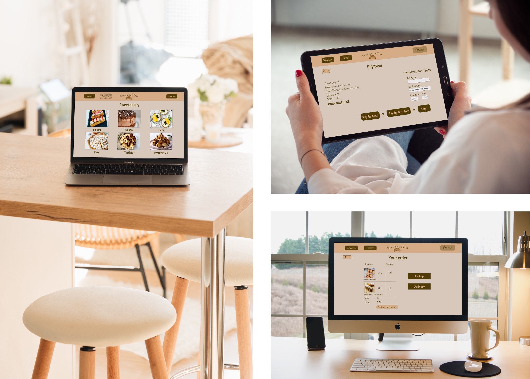
I conducted user interviews, which I then turned into empathy map to better understand the users I’m designing for and their needs. I've found that many target users are annoyed by long lines at bakeries, so they prefer online shopping and/or home delivery. Another issue that has come to light is that bakeries' websites do not list the ingredients for each pastry, which is extremely important for diabetics, vegans, etc. Last but not least, we discovered that bakery websites are not accessible enough for the visually impaired.

Pain points

1. Menu: bakery websites usually do not have very well organised menu, which results in confusing navigation.
2. Checkout: a very small number of bakery websites allow cash or terminal payment on delivery.
3. Exclusion: bakery websites often don’t provide what's needed for individuals who follow the diet.
4. Accessibility: most bakery websites aren’t accessible enough for individuals with visual impairments.

Design

Sitemap

Difficulty of the bakery websites menu was one pain point for users, so I used that knowledge to create a sitemap. I decided to make strategic information architecture decisions that would make it easy to navigate within the website. The structure I chose was designed to make all pages clearly defined and buttons big enough to easy understanding for user their next step.

Paper wireframes

Drafted iterations had been changing during the process of creating digital wireframes to ensure that all the elements are well-suited to address user pain points. For the home screen, I prioritized a clear and specific position for two important buttons on the navigator bar — savoury and sweet pastries so it's easy and accessible enough for all users to quickly find what they want to order.

Paper wireframes screen size variations

Because Bake your day’s customers access the site on a variety of different devices, I started to work on designs for additional screen sizes to make sure the site would be fully responsive.

Digital wireframes

Moving from paper to digital wireframes made it easy to understand how the redesign could help address user pain points and improve the user experience. Prioritizing useful button locations and sizes and also visual element placement on the home page was a key part of my strategy.

Low-fidelity prototype

I created a low-fidelity prototype by connecting all of the screens involved in the primary user flow of adding items from Savoury and Sweet sections to the cart and checking out. At this point, I had received feedback on my designs from members of my team about things like placement of buttons and page organization. I made sure to listen to their feedback, and I implemented several suggestions in places that addressed user pain points.
View Bake your day low-fidelity prototype

Usability study

Parameters:
Study type: unmoderated usability study.
Location: Ukraine, remote.
Participants: 5 participants.
Length: 15-20 minutes.
Findings:
Round 1:
1. Users need a text field to leave a comment about their order.
2. Users want an easy way to put in the required address information.
3. Users want the cart page includes the taxes field.
Round 2:
1. Users want to have a way to edit the quantity of items in the cart.
2. Users want to see all the ingredients of pastries.

Refining the design

Mockups

Based on the insights from the first round of usability study, I made changes to improve the site’s checkout flow. One of the changes I made was adding the option to leave a message with additional information or changes about the order. Also has changed the process of filling in the address of delivery which is now more clear and easy for users. 

High-fidelity prototype

My high-fidelity prototype followed the same user flow as the lo-fi prototype, and included the design changes made after the usability study, as well as several changes suggested by members of my team. 
View the Bake your day high-fidelity prototype for desktop
View the Bake your day high-fidelity prototype for mobile devices

Accessibility considerations

1. I used headings with different sized text for clear visual hierarchy .
2. I used high color contrast in the text and buttons to make it easy for all users to navigate the site.
3. I used landmarks to help users navigate the site, including users who rely on assistive technologies.

Impact

After conducting the second round of usability study, our target users confirmed that the design was intuitive to navigate through, more engaging with the images, and demonstrated a clear visual hierarchy. 

What I've learned

I learned that even a small design change can have a huge impact on the user experience, such as adding filters to easily find food for diabetics, vegans, and people on other diets. The most important takeaway for me is to always focus on the real needs of the user when coming up with design ideas and solutions.